")
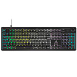
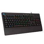
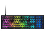
 Wireless gaming keyboard - mechanical touch switches (GL Tactile switches) - LightSpeed technology - RGB backlighting with Lightsync technology - AZERTY, French")

")
")
")


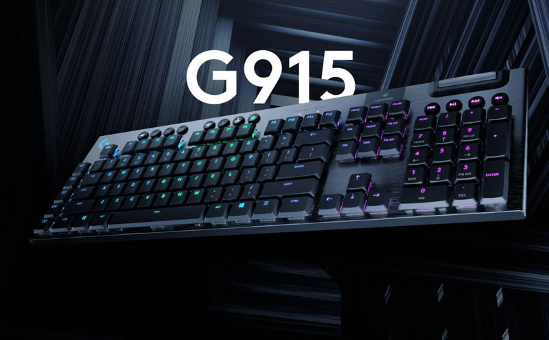

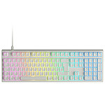
When marketing trumps user experience
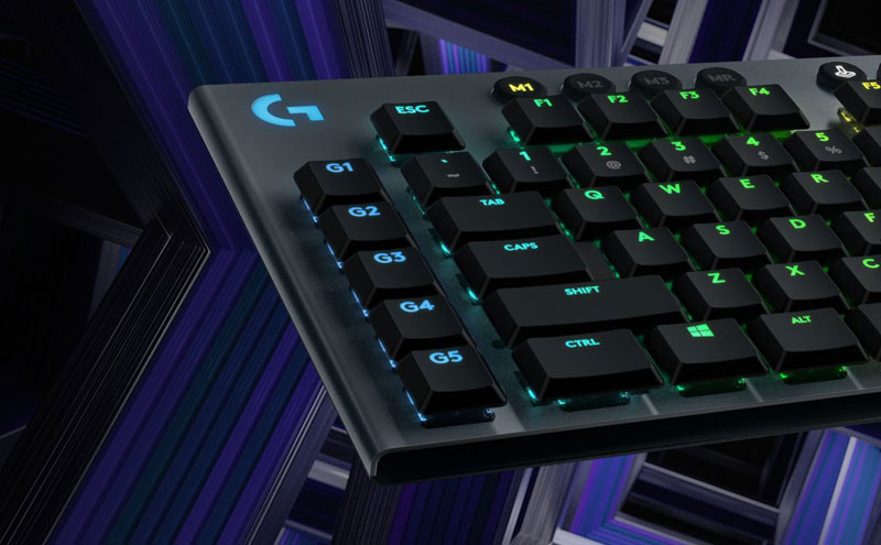
This keyboard is out of the ordinary. Unnecessary keys labelled "G1, G2, etc" destroy the ergonomics of the keyboard by being located to the left of the tab, caps, shift and ctrl keys. This stupid placement reduces ergonomics to nothing. You can't tell whether you're pressing tab or G2, shift or G4, etc... Another invention from the tortured brain of a marketing company that's lost its bearings.
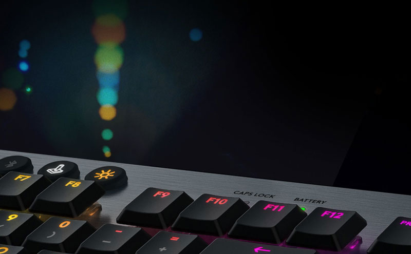
On the "." key, it's the ";" character (shit + .) that is lit up, the "." is not visible. The same goes for the 1 to 0 keys, the % and the /.
Finally, the touch is unpleasant, I don't know why this ridiculous invention of a 'tactile' touch where the keys are spongy, with no firm pressure and a spongy return.
At the insane price of 250EUR for a keyboard, it's a load of rubbish.
Absolutely avoid it.
")
")
")
")


")
")
")


")
")